Microsoft’s gone Modern! – Windows 8 and “Modern” UI Style

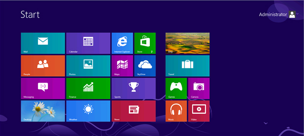
Microsoft is getting a full make over! We had been hearing from Microsoft that the “Metro”, which is now called the “Modern” UI Style is going to be defining UI style through the bold use of color, typography, and motionstyle creating a brand new, live and fresh experience across all of Microsoft products. But over the last few months we started realizing that it’s a change in Microsoft’s DNA. Everything that’s published by Microsoft follows this UI Scheme, even Microsoft banners, handouts all are following the same theme. Microsoft changed its logo this morning – something that had not happened since 1987, but did you take a look at the new logo – here it is.

You can see that it’s all part of the same make over. You better believe it – Microsoft is super serious about the Modern user experience!
Stay tuned! I’ll write more about best practices for development of Windows 8 and Modern UI applications.
Namasthe!
[simple-social-share]


